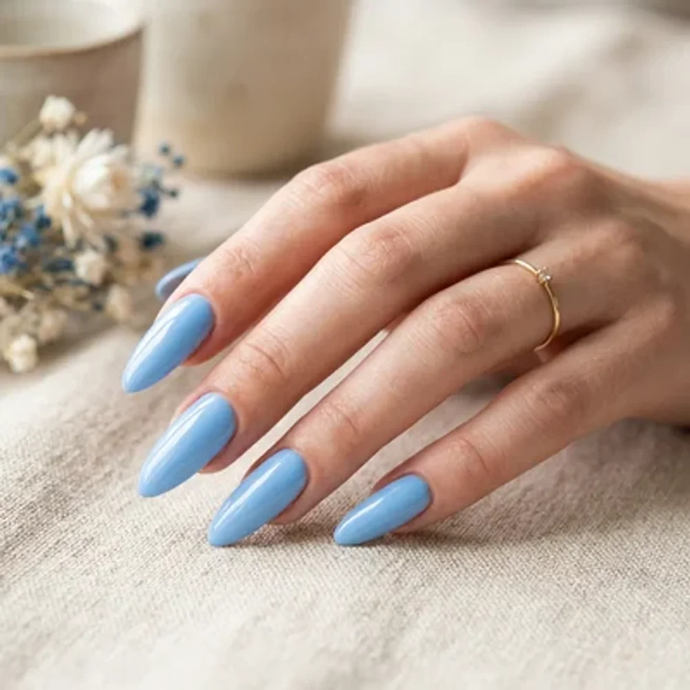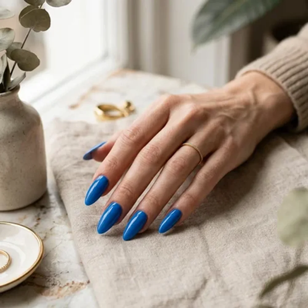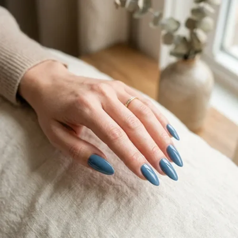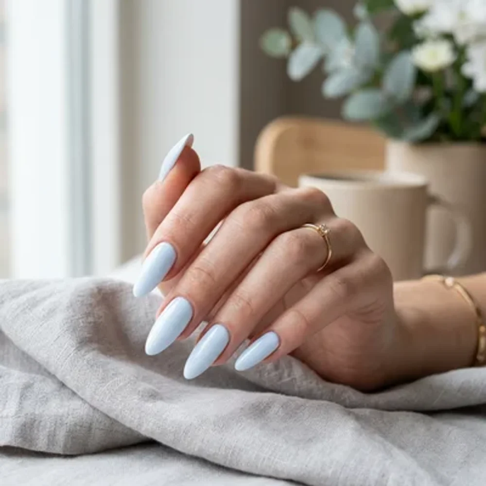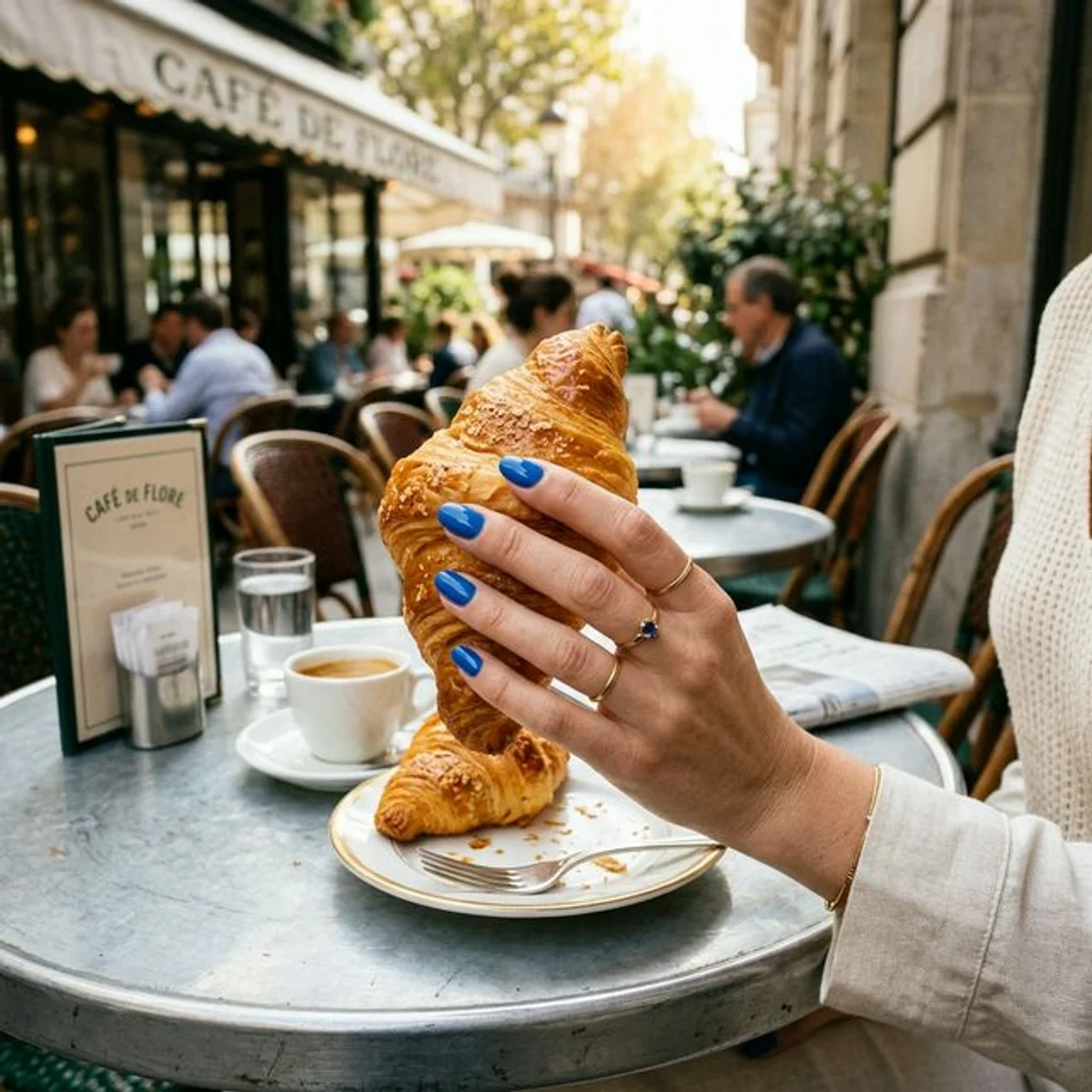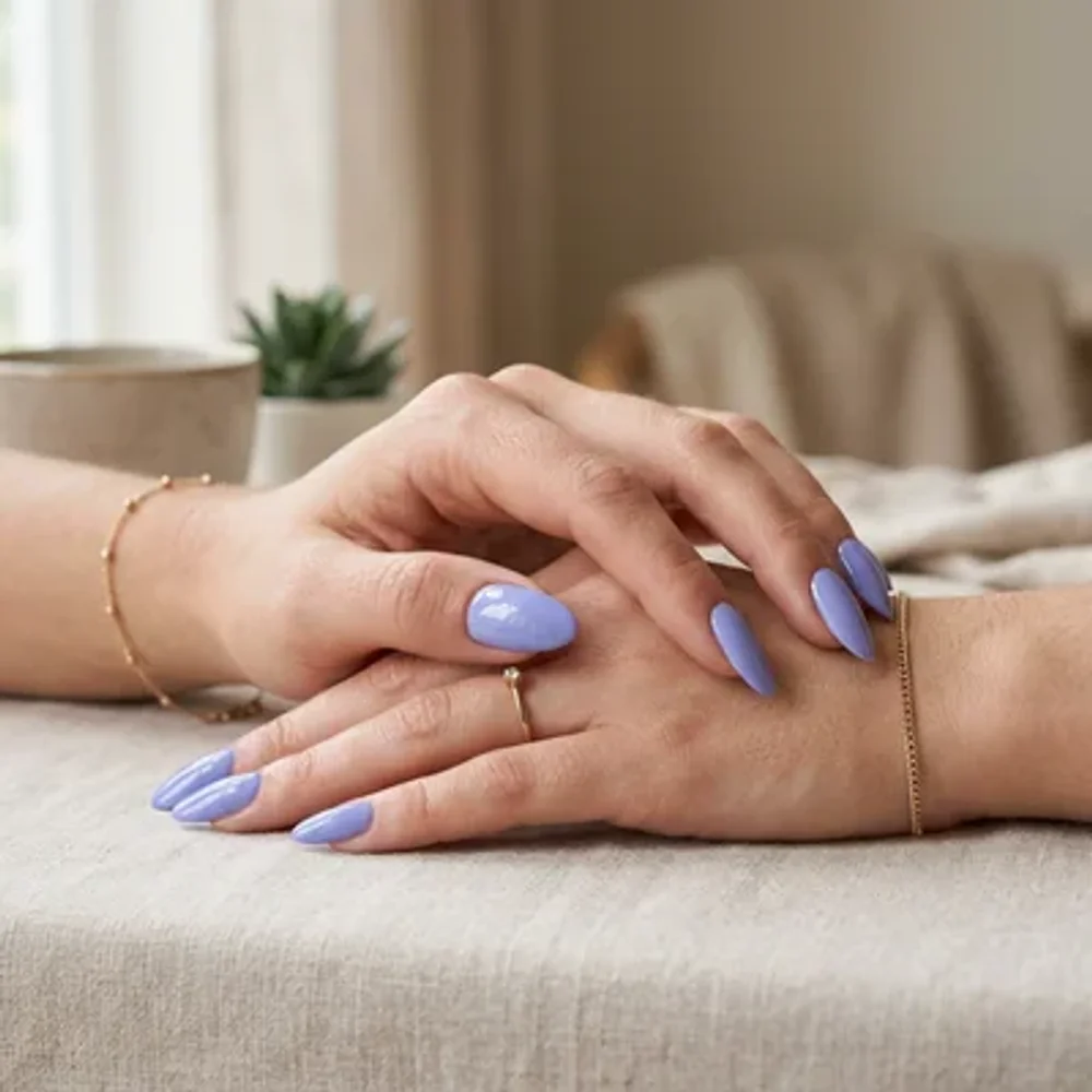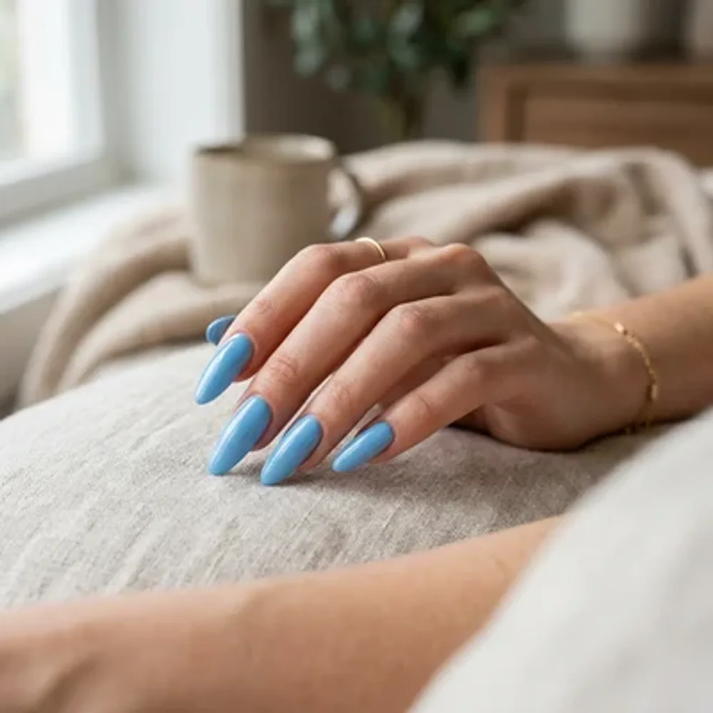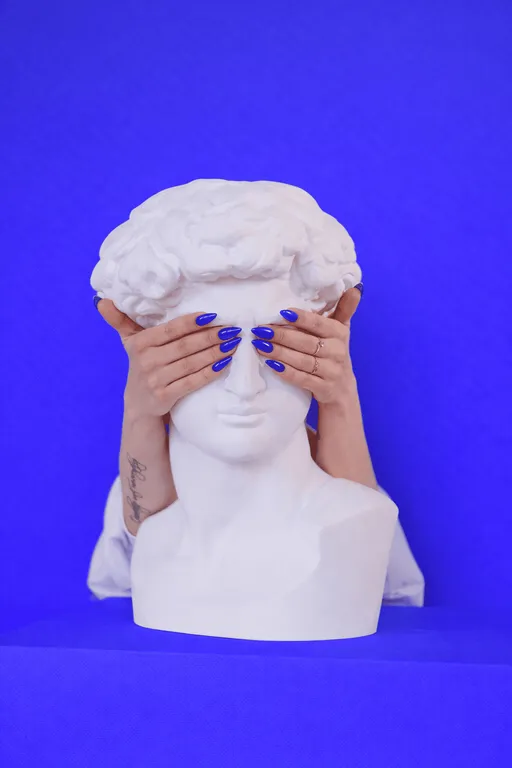
Purplish Blue
Purple has enough room in Purplish Blue to matter. White makes it crisp; lavender makes the contrast more related.
Colors
Purplish Blue#601EF9
Tags
#purplish blue#summer nail colors#bright nails#purplish blue nails#summer manicure
Details
White makes the blue-violet look crisp. Lavender keeps the colors related while still giving a lighter area.
Both suit a hue that has a strong purple share, rather than a plain blue with a faint tint.